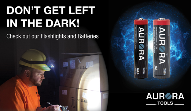
2021-Present • InDesign
A collection of my favourite web ads I have created for Tenaquip’s preferred brands. These are mainly created for customers selling preferred brands products and would like digital ads made for their marketing materials. They are are also used on the preferred brands websites in rotating banners.
I had to create an ad for Aurora Tools’ flashlights and batteries. The text was already provided so I had to mock-up a design. I first started with some product research a looked at competitors’ ads like Energizer. I noticed that a lot of ads had a darker theme and featured electricity arcs. I then placed all the elements on the page and played around with the positioning of the batteries. In the end I love how it turned out. There is a nice hierarchy of elements and the design is well balanced.
Zenith Safety Products wanted to promote their line of signs for the September issue of the Canadian Occupational Safety magazine, so I was tasked with creating an ad. This ad was the most challenging I have created because there are hundreds of signs Zenith has to offer, and it was difficult choosing which ones were worth showing. Like always I did some research on other safety sign ads out there, but there weren’t that many. I knew I wanted to create some sort of collage of their most popular signs because it’s the best way to promote many signs. For the collage, I added a variety of different signs both in English and French, but mainly English because it’s an English magazine. I darken the overall collage, so it wouldn’t draw attention away from the left side.
Aurora Tools wanted to push their newly upgraded measuring tools to their customers, so I created one. The image was already chosen to be used by the marketing manager, and they provided the text, so there wasn’t that much room to be creative. I usually place the text on the left side of the project, but I couldn’t because of the placements of the tools. So, I placed the text wherever there was space. I found that the look was too white, so I added a grey rectangle to section off the design to make it more dynamic.
RMP wanted to advertise their new line of wiping rags to their customers. I wanted the overall colour to be green because the rags are made from recycled T-Shirts and the colour green is used in the recycling industry. The overall design makes the rags look like they are there to save the day and the chosen background really emphasizes that message. The text meaning also adds to the message as well.
Weld-Mate needed an ad created for a rotating banner on their website and welding gloves was the chosen product to be featured. I first started off with research and sketching out layout designs. While researching, I took note on key elements throughout different welding glove ads like the dark colour themes, spark elements and a grungy feel to the ads. I created a dark coloured grungy ad and used sparks across the design to blend the two images together and to allude that they are gloves meant for welding. In the end, I love how balanced it is and the dark theme made the gloves pop.
Zenith Safety Products just launched their Spill Pallet line, so they needed me to create an ad to promote them. They really wanted an application shot of the product but, we didn’t have any because the line was so new! So, I worked my magic in Photoshop and created one! The background was AI generated, and I added the shadow post-production. I darkened part of the background because it was too busy and, so the text was more legible.