2021-Present • InDesign
A variety of packaging projects created for Tenaquip’s Preferred Brands. Generally, I would receive the die cut, product info and competitor’s examples to get started. I would first start with some product research for inspiration and to determine a possible colour pallet, fonts and visuals for the project. I would then present 2-5 mockups to the product manager and after a few rounds of proofing/corrections I would have the final die cut design.
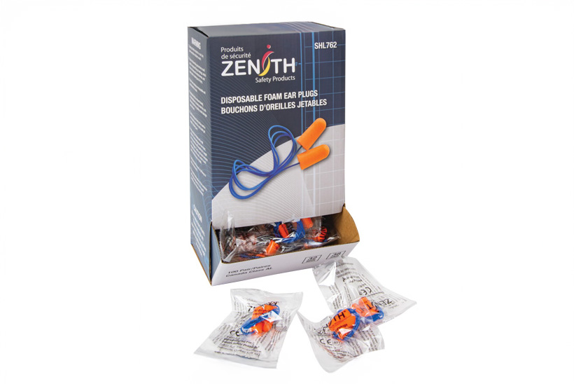
I designed the packaging for Zenith’s new line of earplugs, aiming to create an eye-catching design that highlighted the product while maintaining brand identity. Two main challenges were the lack of professional product photos and a complex die cut. To visualize the structure, I printed and assembled the die cut, labeling each face to ensure proper content placement. I photographed the earplugs with my iPhone, then edited them in Photoshop—color correcting and removing the background. For the front design, I used a dark blue background to make the orange earplugs stand out and added a semi-transparent white swoosh to emphasize the cord. The final result received great feedback from the managers.
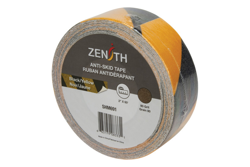
I had to create the circular label for Zenith’s new anti-skid tape. Even though it seems like a small project it was challenging. I really wanted Zenith to have its own look to stand out from competitors, but due to the limited amount of space it was difficult to be creative. Logically, it made sense to place the title and logo at the top center and have the UPC code below. I let my creativity shine, with the tape colour by making it a piece of tape.
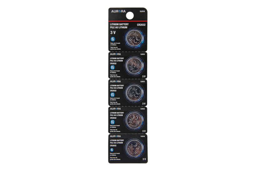
Aurora Tools extended their line of batteries, and I had to design the blister packs for the 3 V batteries. We have some brand guidelines, so the fonts, imagery and colours were pre-determined, but the rest I had creative control! My favourite element is the orb of energy behind the battery. It makes the battery pop from the background and adds more energy to the packaging.